The Quietus is widely respected in digital music communities for their incisive opinions. The publication emphasizes text and exposition over anything commercial — they are the Anti-Listicle Website — and too often at the expense of readability. I took on this difficult brand for a class project in the spring of 2019.
The original logo felt dated—most egregiously, the publication’s URL sits at the bottom of the logotype, as if this were 1998—so we gave the mark a clean refresh.
The old logo’s thick brackets recall old literature and metal music—apt connoations for a high-brow music reviews site. But the high contrast of the thick and thin strokes and all-caps make the brand feel severe, so we replaced with a cleaner—but still literary—sans-serif.

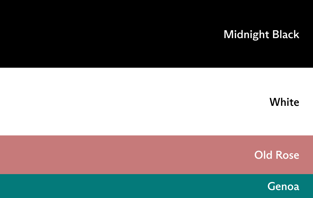
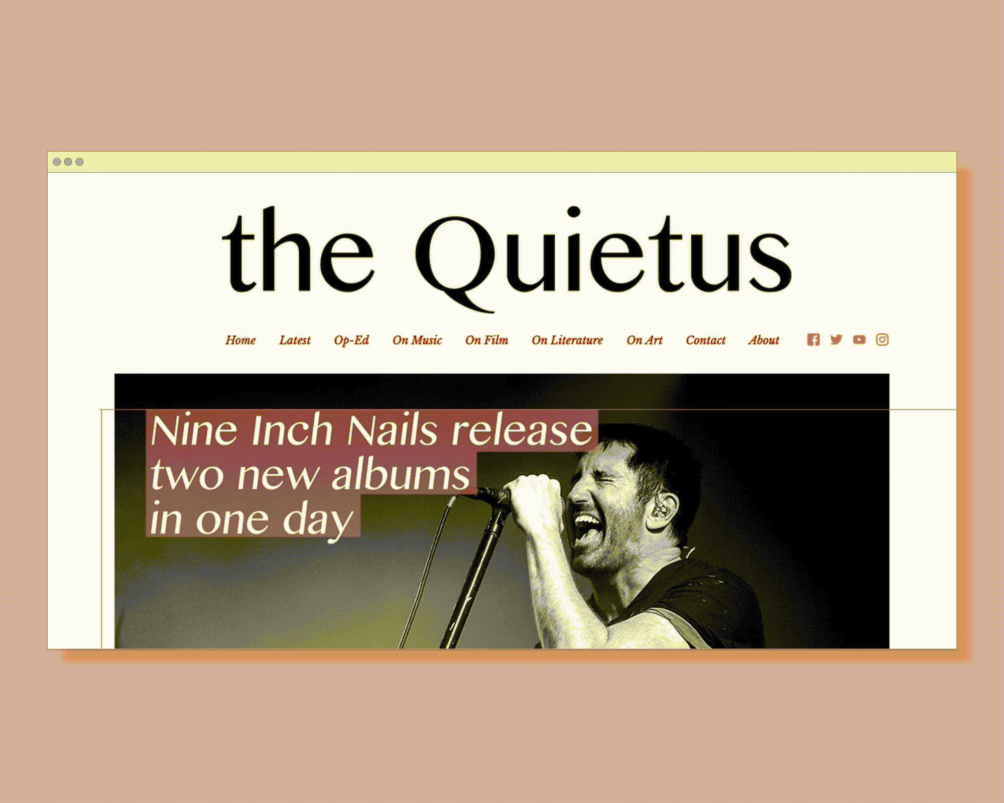
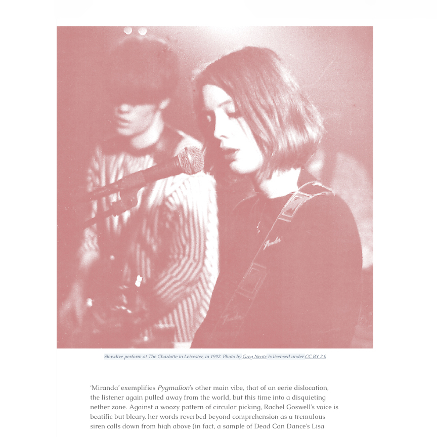
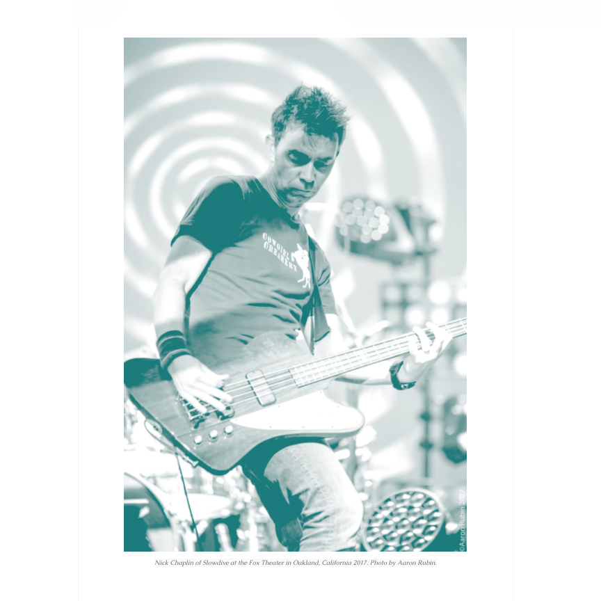
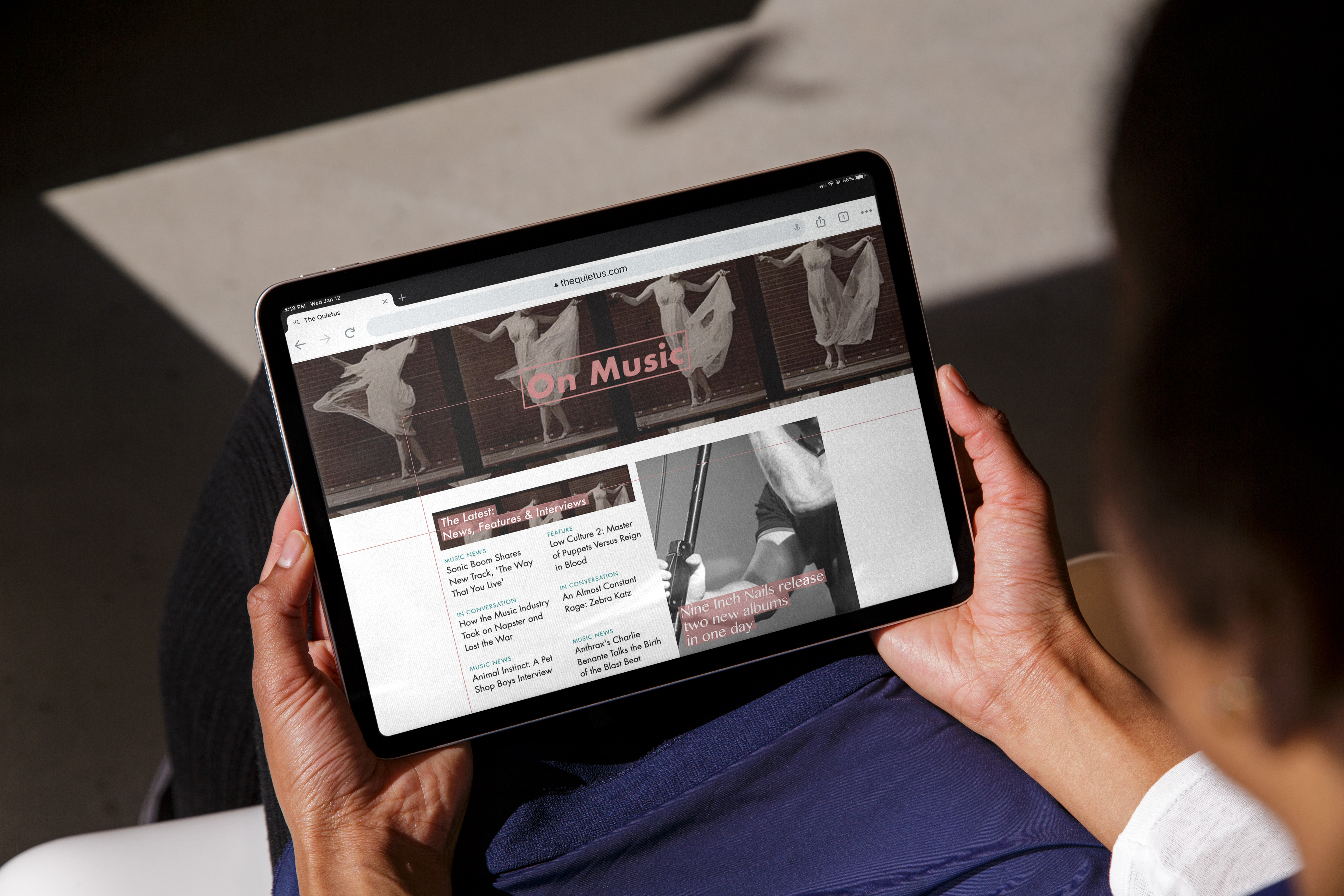
The new tQ color scheme embraces simplicity, with the majority of its imagery in black and white. Old Rose and Genoa accents give the brand vibrance and greater visual interest.
We’ve selected Futura Medium as the workhorse header font: It’s stylish, modern and versatile.
We needed to amplify the brand’s vitality on its featured articles and hero images, though, and Futura alone would not do the tQ justice. We turned to the logotype, Bangla MN, for more expressive headers on the site’s hero images.
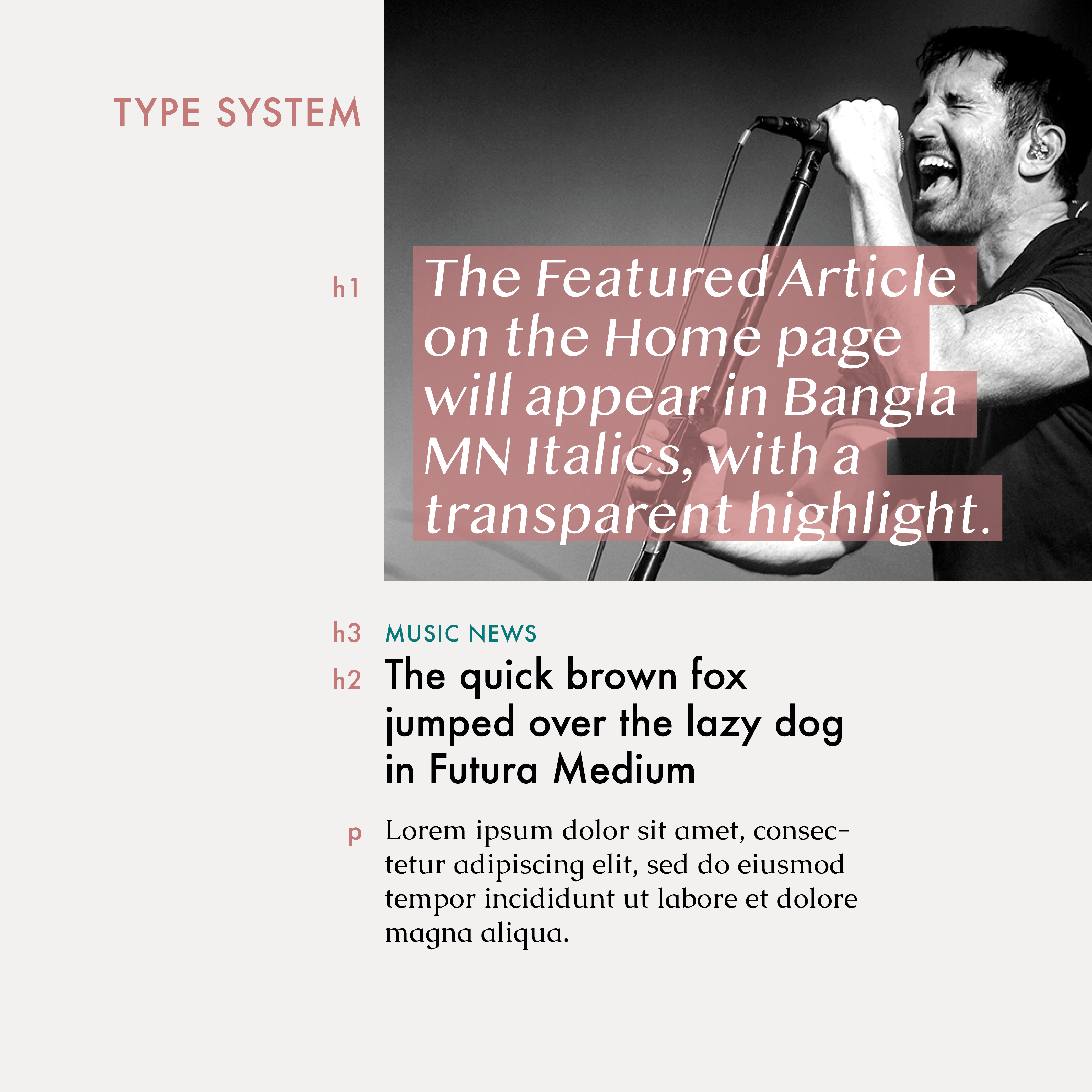
Our h1 type, Bangla MN Italics, sits on the photo of Trent Reznor. The typeface’s tall x-height and large counters give the tQ’s voice much more assertiveness than Futura could (as pictured in our h2 and h3 type).
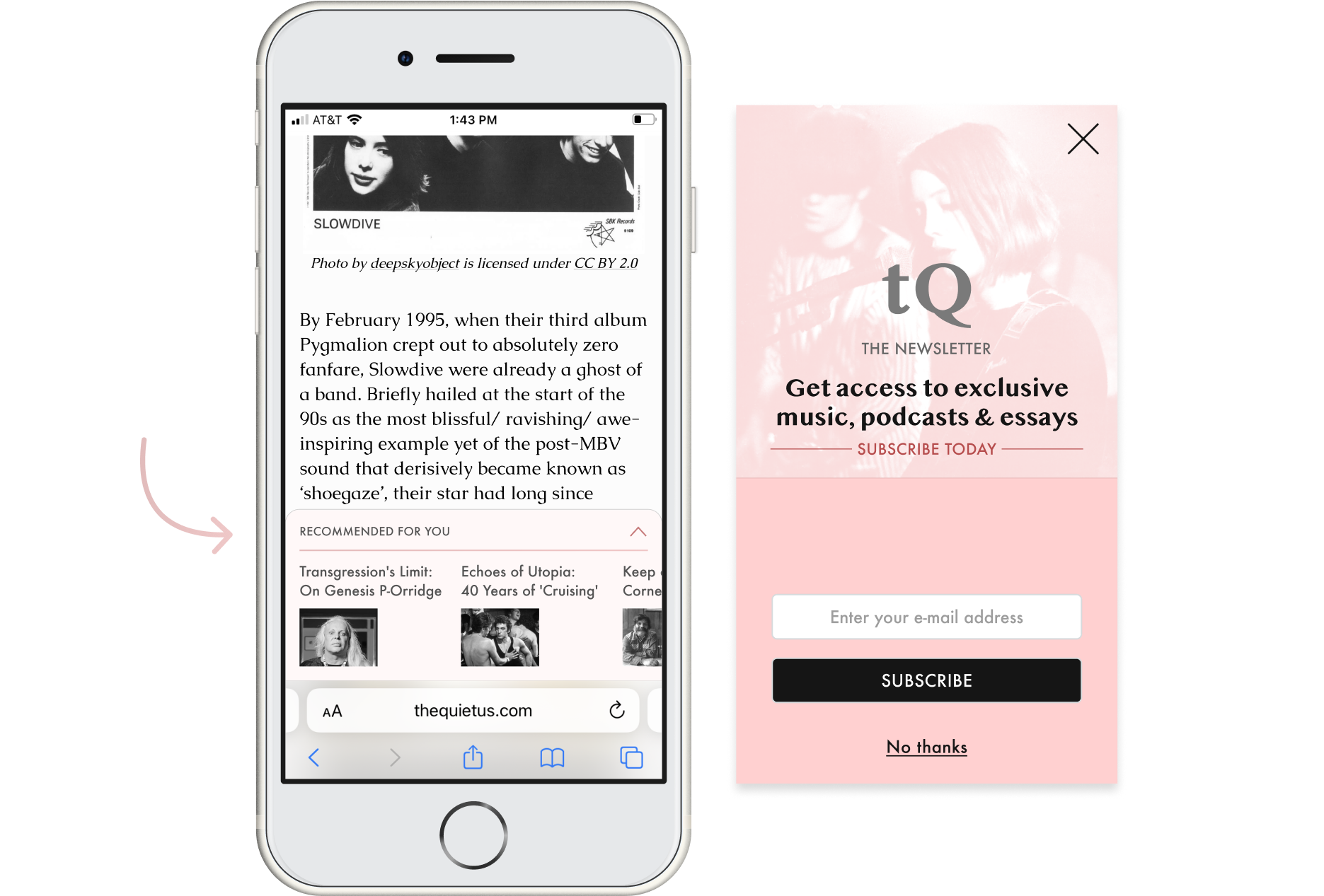
On mobile, a “Recommended for You” banner appears at the bottom of the screen. This banner appears only upon scrolling up through an article (not while scrolling down, when the reader is consuming the content). The user can expand the banner and view additional recommended content—ultimately staying on-site longer and driving more impressions on client ad campaigns.
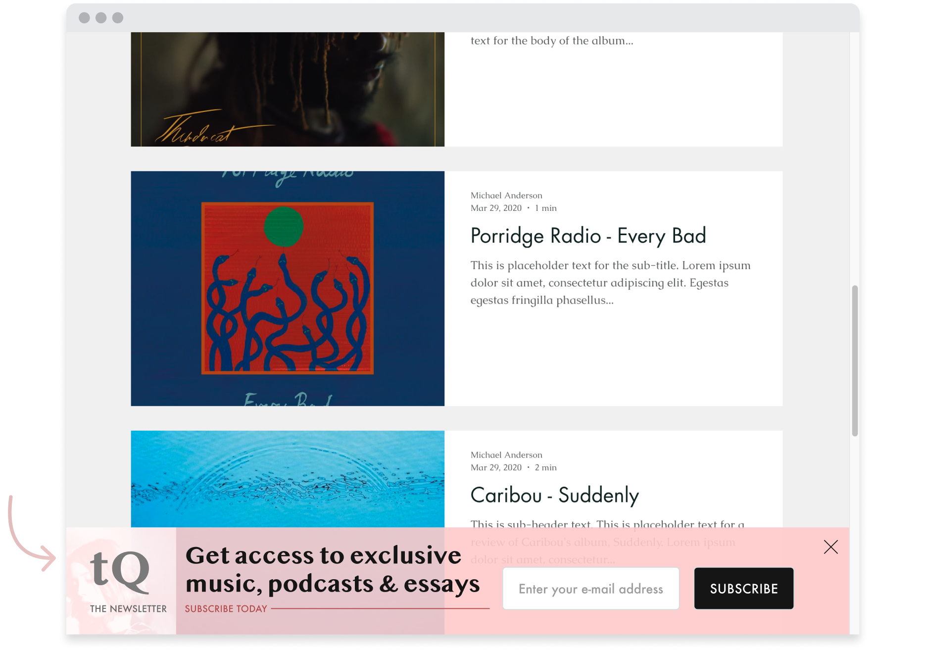
To drive return visits, I designed a subscription banner that highlights the exclusive content users can recieve. This ad appears as a modal on mobile and a banner on desktop.