This user interface was hypothetical in nature: When interest rates rose in the summer of 2022, Landed needed to pursue alternative sources of funding, including “white label” opportunities. As part of that effort, I designed the UI for some capabilities that didn’t yet exist on landed.com, and I wrote a deck that pitched and promised that digital power.
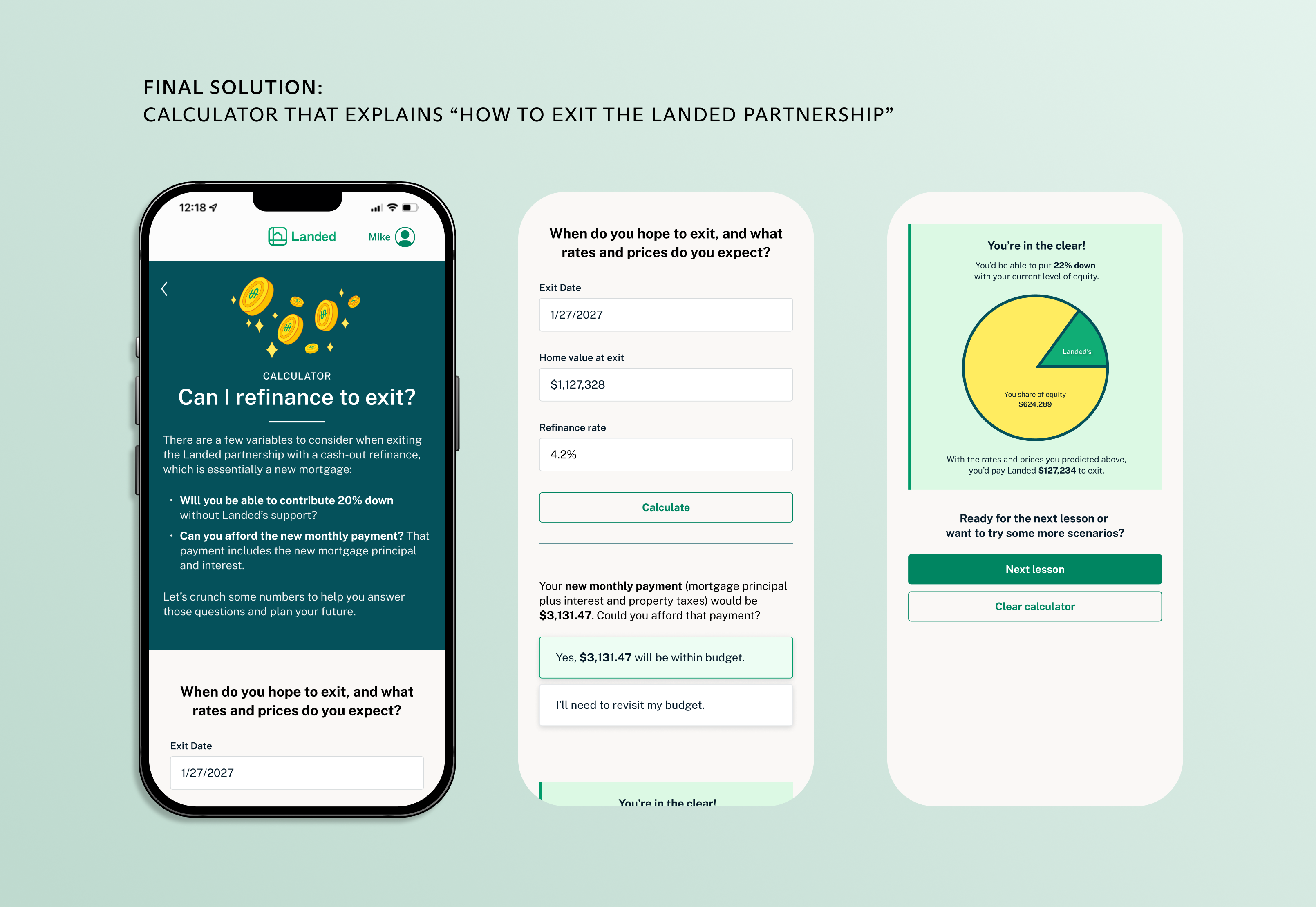
Specifically, this tool would help customers understand when to exit a shared appreciation agreement (more on what all that means later).
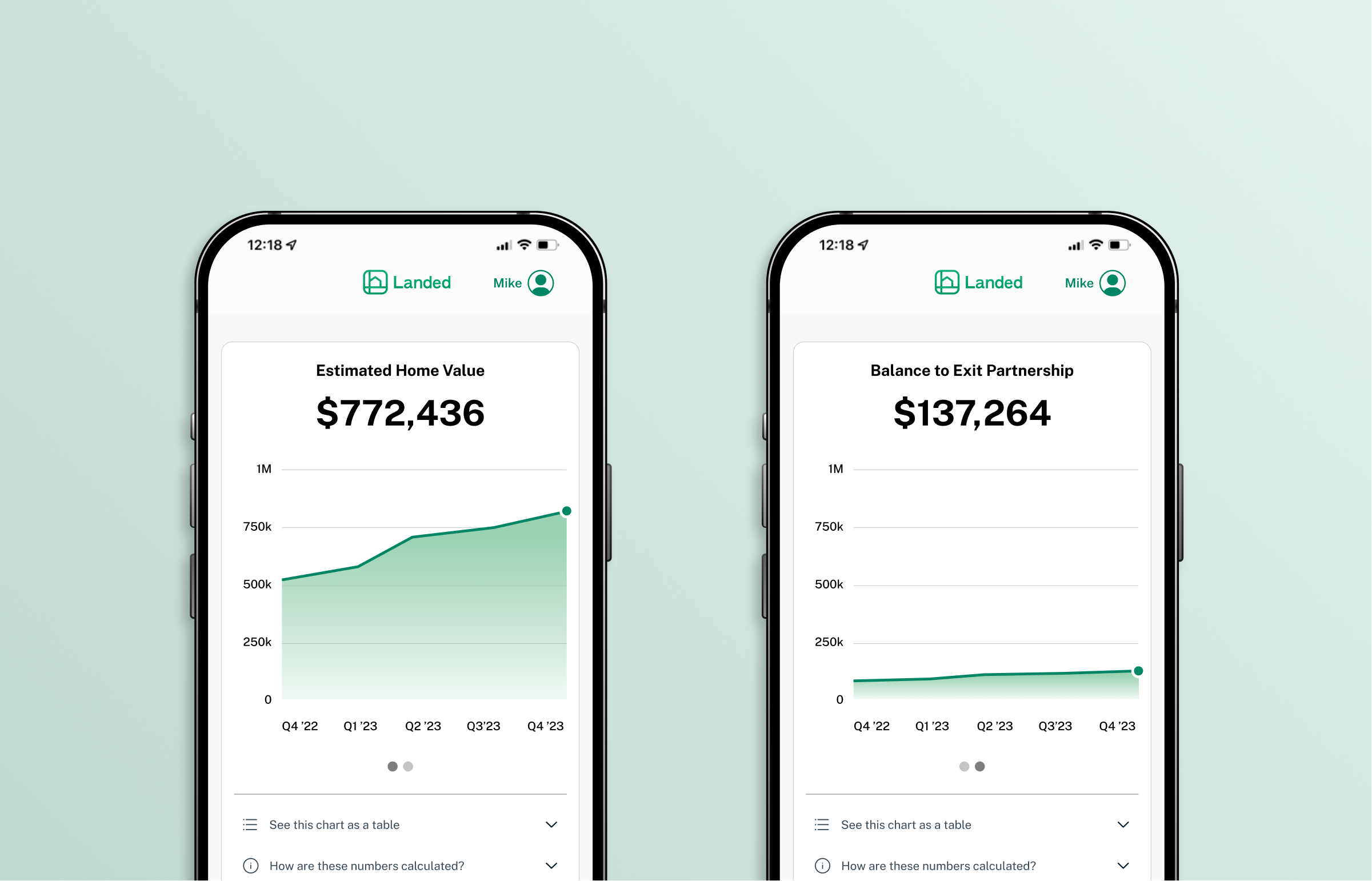
Landed’s business and investment model was shared appreciation homebuying: We would offer up to $160k toward an eligible customer’s home in exchange for a cut of the appreciation in value of the home when the customer sold or refinanced plus the amount we co-invested. (we would also share in the loss if the home fell in value).
We already had a flow for onboarding customers to a shared appreciation agreement. It was the end of that customer journey (a customer exit) that needed a digital component.
The longer a customer stays in a shared appreciation agreement, the more they have to pay their co-investor (i.e. Landed or a “white label” partner) as their home goes up in value. At a certain point, a customer will hit a breakeven point, where the cost of staying in the partnership is higher than the cost of paying out the co-investor.
The Investments Team at Landed had historically notified our customers manually, via snail mail, when they expected a customer was ready to exit (given how much equity they would’ve built in the home). My job was to digitize that flow and empower the user to understand their breakeven point themselves.
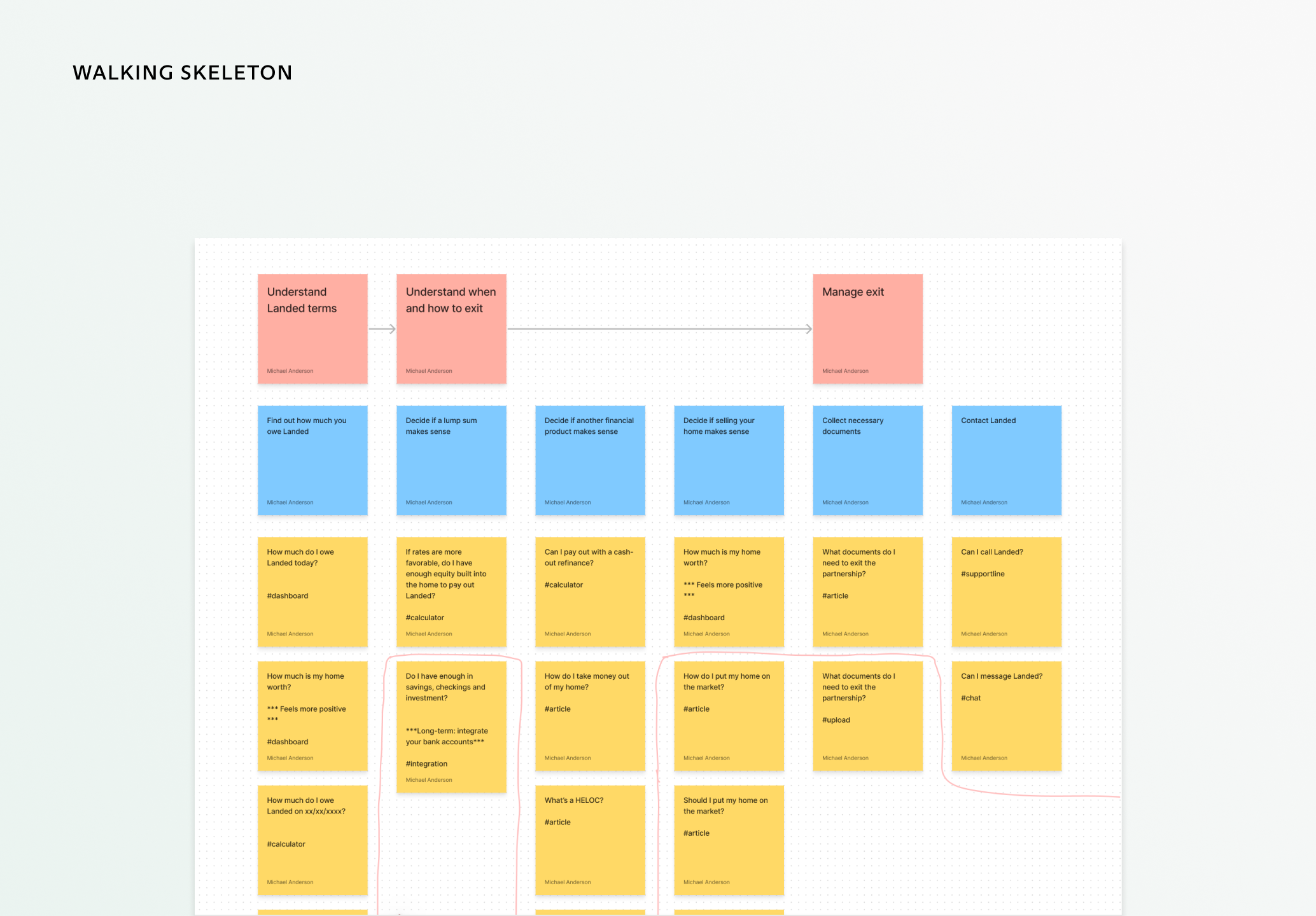
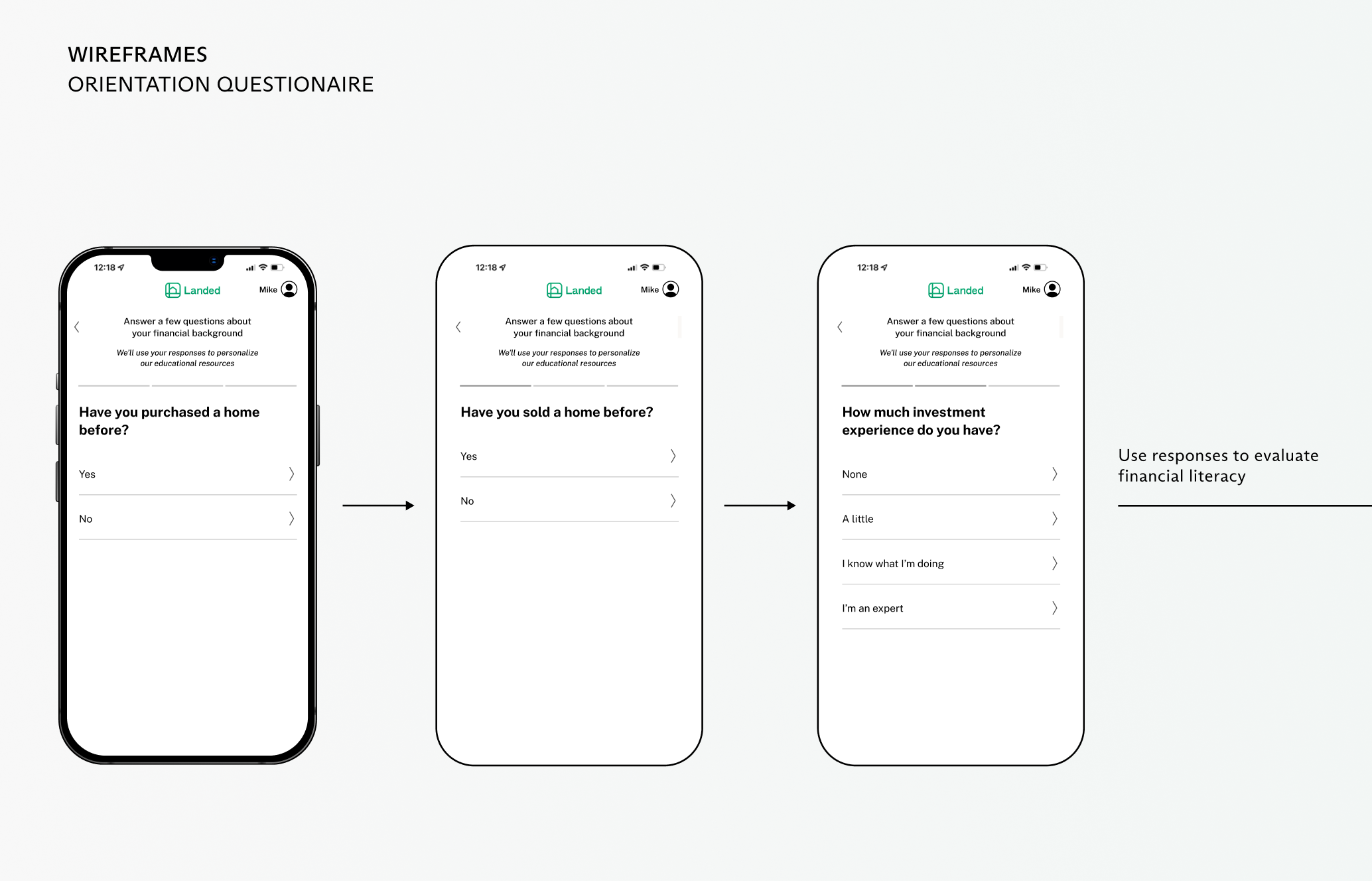
I interviewed four members of the Investment Team to understand user pain points (for the purposes of this pitch, we didn’t have time to recruit users themselves). Among the largest challenges I identified was simply educating our users on personal finance topics because, in order to exit as early as possible, many users might consider a HELOC or cash-out refinance.
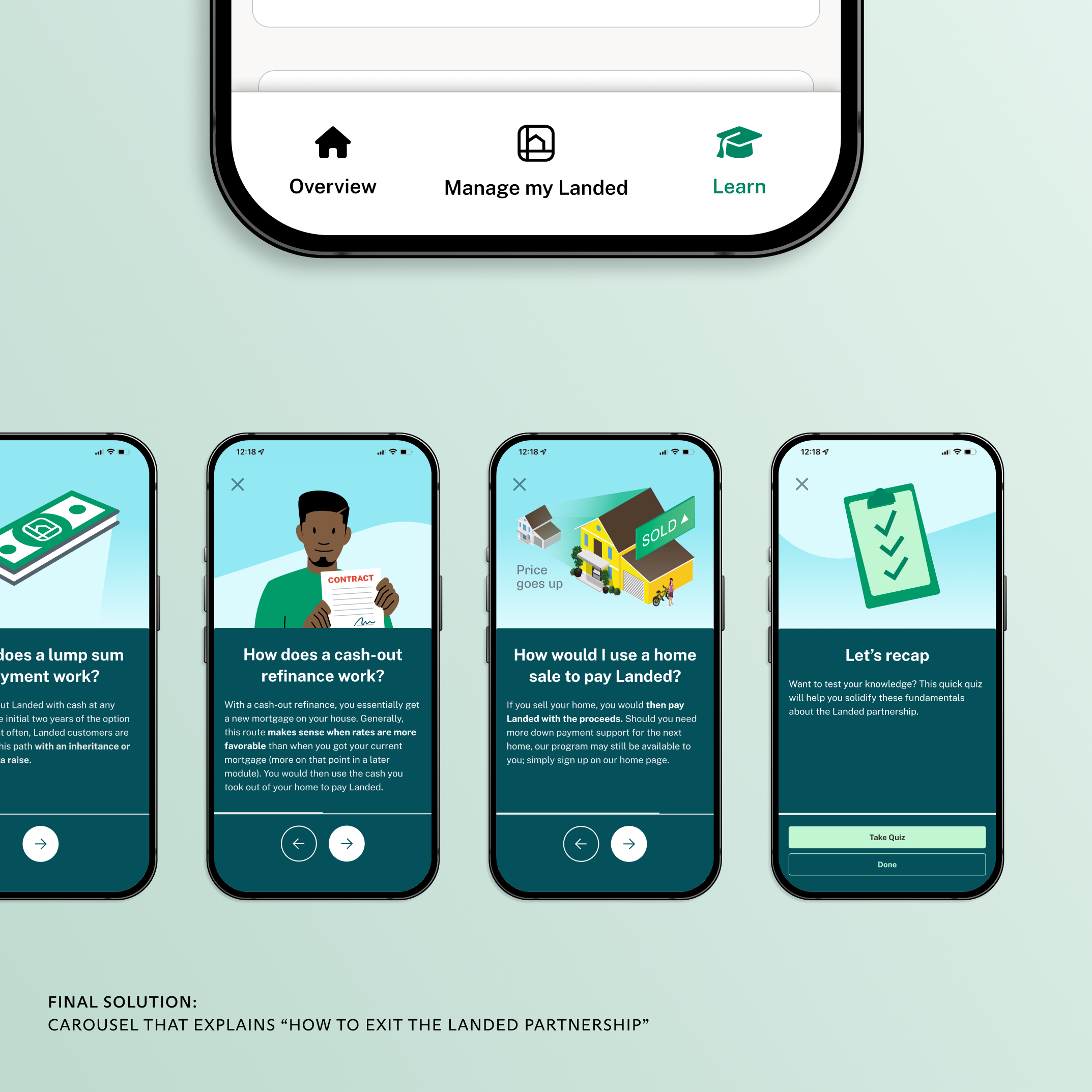
Each user would want to learn about these products in a different way, depending on factors like financial savviness and preferred consumption method (i.e. a deep dive into an article vs. a phone call v. watch a video). For the purposes of this pitch, I opted for content that would be simpler to build, like a carousel rather than video.
To complicate matters further, our Compliance Team told us that we can’t give explicit financial advice. Yet I still wanted to create a tool that could offer users a comprehensive view of their options to exit a shared appreciation agreement, and that included at least making users aware of HELOCs, refinances, et. al, if not explicitly recommending them.
After placing ideas in order of priority, I grouped the ones that were necessary to construct a cohesive MVP: all the yellow sticky notes above the pink line.
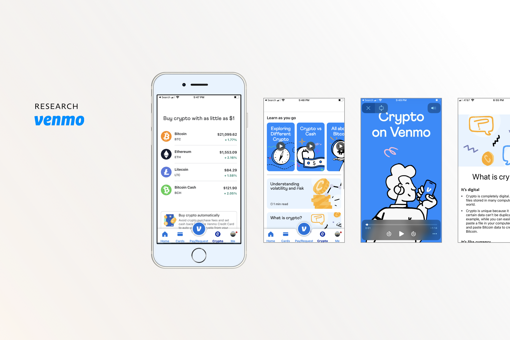
I visited the world of cryptocurrency as I ideated, and that industry turned out to be a great analogue. Crypto, like shared appreciation homebuying, is a newer and poorly understood financial product. So, I turned to products like Robinhood and Venmo’s Bitcoin marketplace. Much like my product, those two companies wanted to do two things for users: 1. Educate them on their financial options and 2. Empower them to take action in-app.
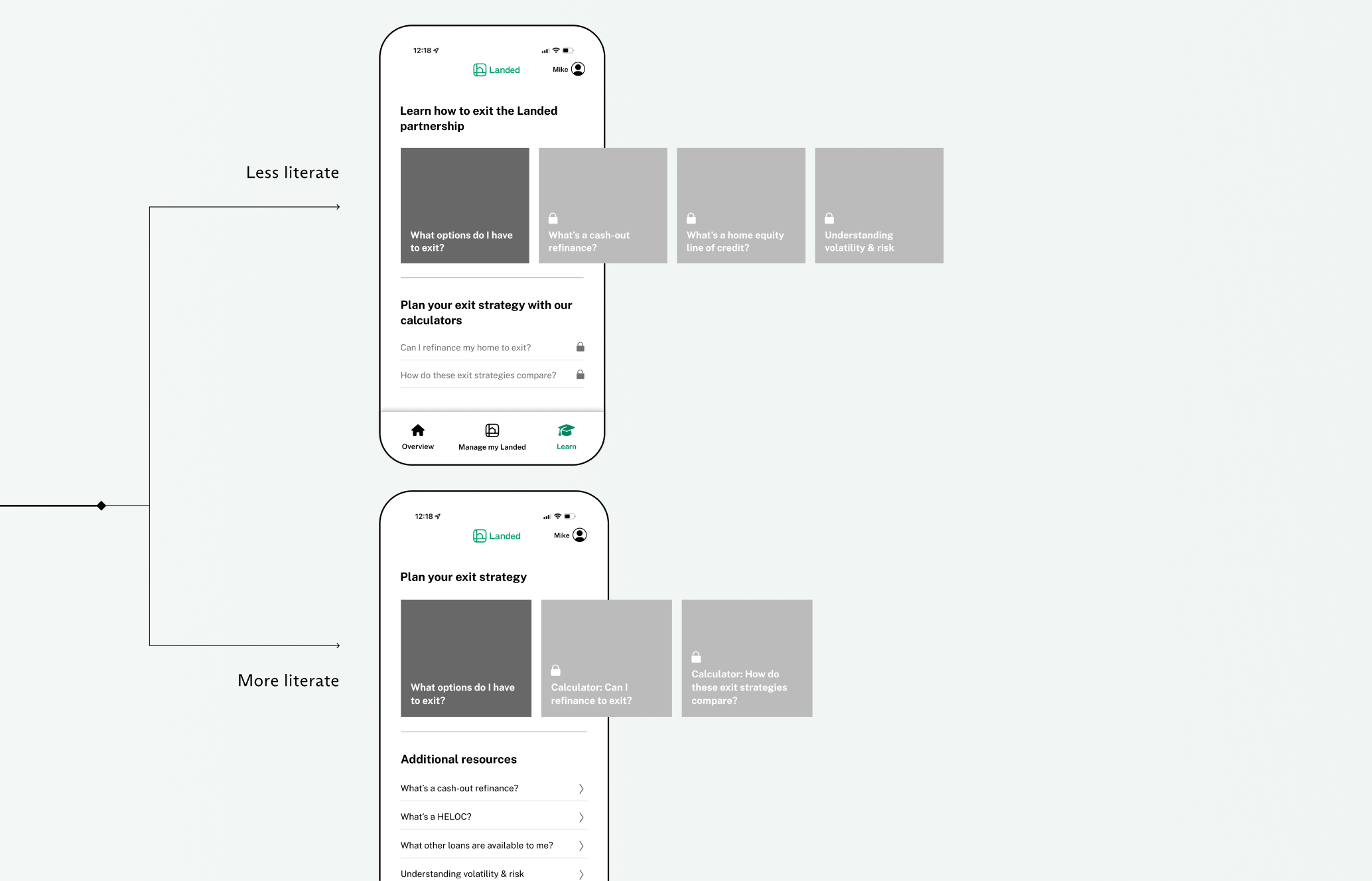
The more time I spent with financial education platforms from Robinhood and Venmo, the more I felt they were overwhelming, even if visually beautiful. For instance, the platforms made all content available to each user instantaneously, without much hierarchy. I opted instead to chunk content: educational modules would remain locked until a user completed the preceding one (see wireframes above), and I chose carousels with short-form text over longer in-app articles.
Moreover, an “orientation questionnaire” would segment users by financial literacy: The more literate users would be able to access “actionable” content like our calculators right away, whereas less literate users would need to view contextual content (“What is a cash-out refinance?”) before accessing our tools and calculators.
Members of the Product, Marketing, and Investments Team praised my work for being big enough to impress potential “white label” partners while still shippable if we had to move fast.