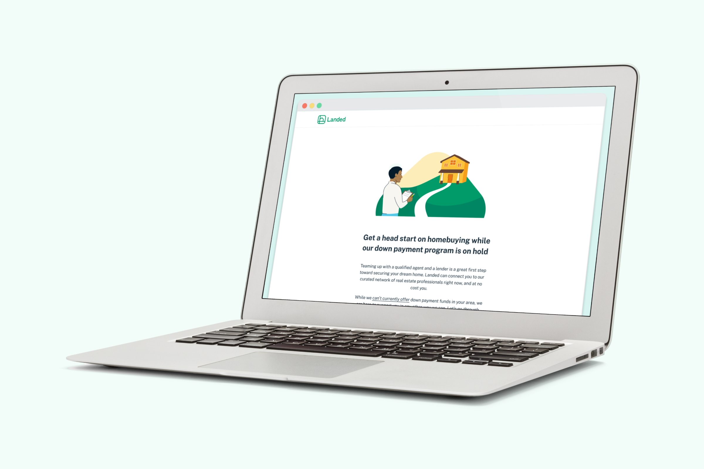
I designed new screens for Landed’s signup flow, which would inform customers in some cities that they couldn’t currently receive down payment support (Landed’s core offering)—yet we still would ask them to signup and onboard.
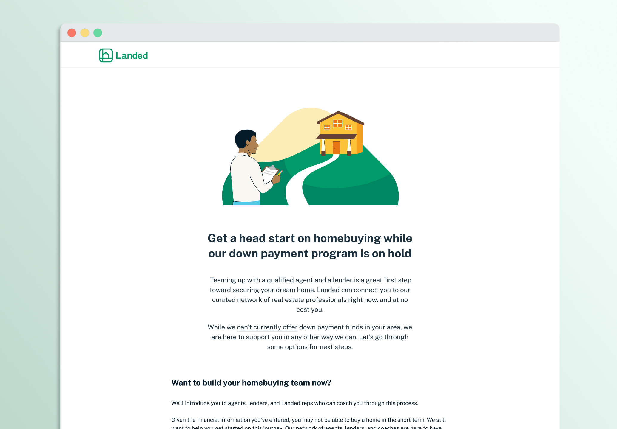
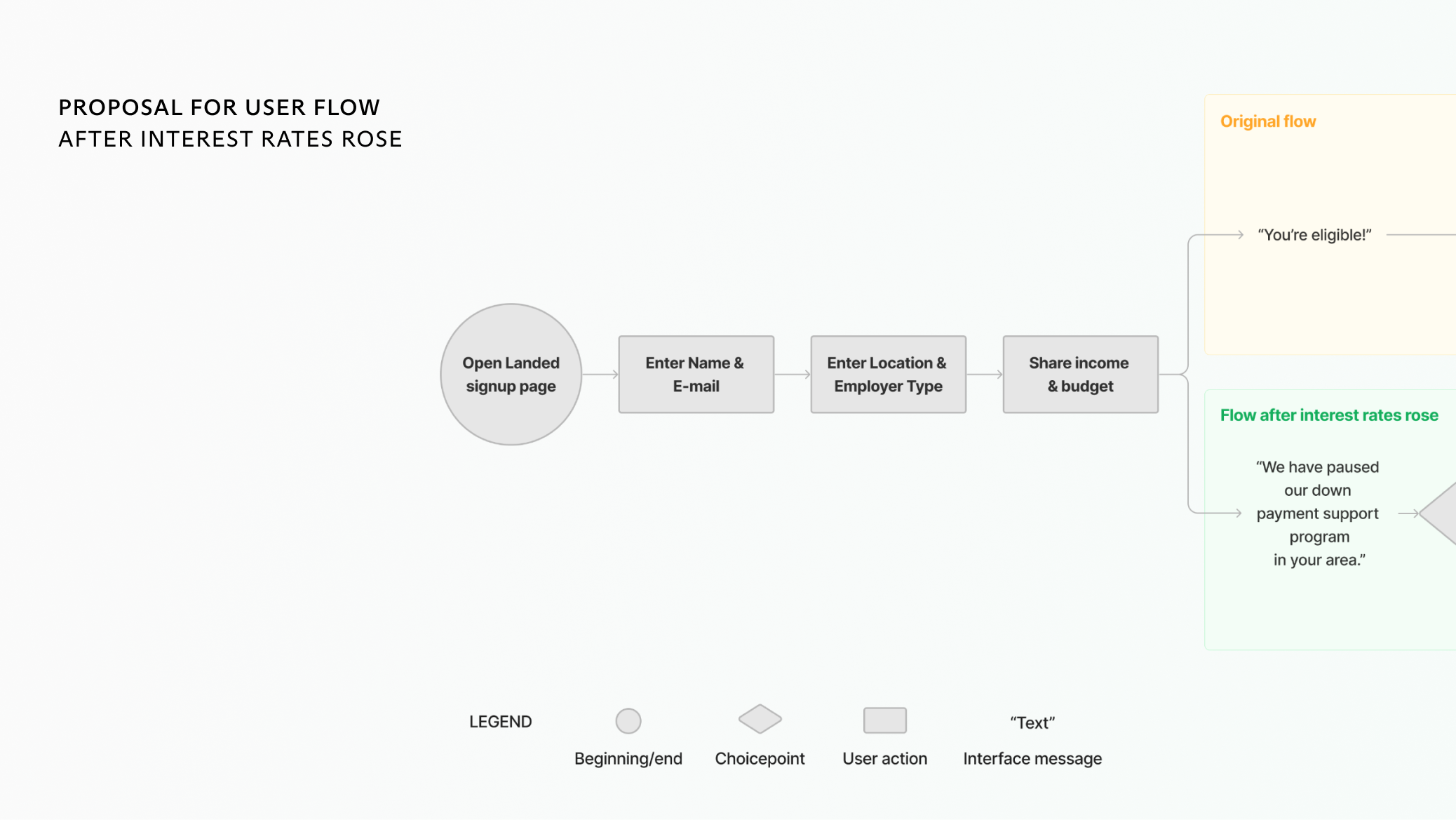
When I joined Landed, our primary offering was up to $160k toward an eligible customer’s down payment in exchange for a cut of the increase in value of the home.
As interest rates rose over the summer of 2022, however, our investors became nervous, and we could no longer support our down payment program in every market.
Landed made money from referral fees: real estate agents would pay us a commission for each homebuyer we sent them. We still wanted to enecourage users to connect with real estate agents even if we couldn’t provide them down payment support.
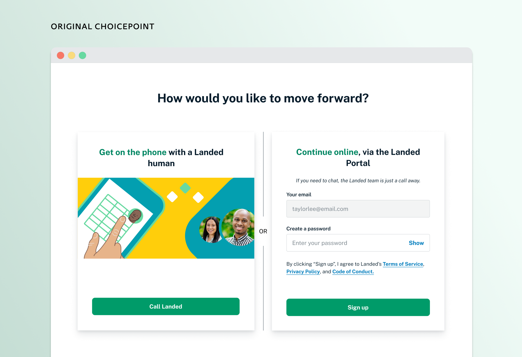
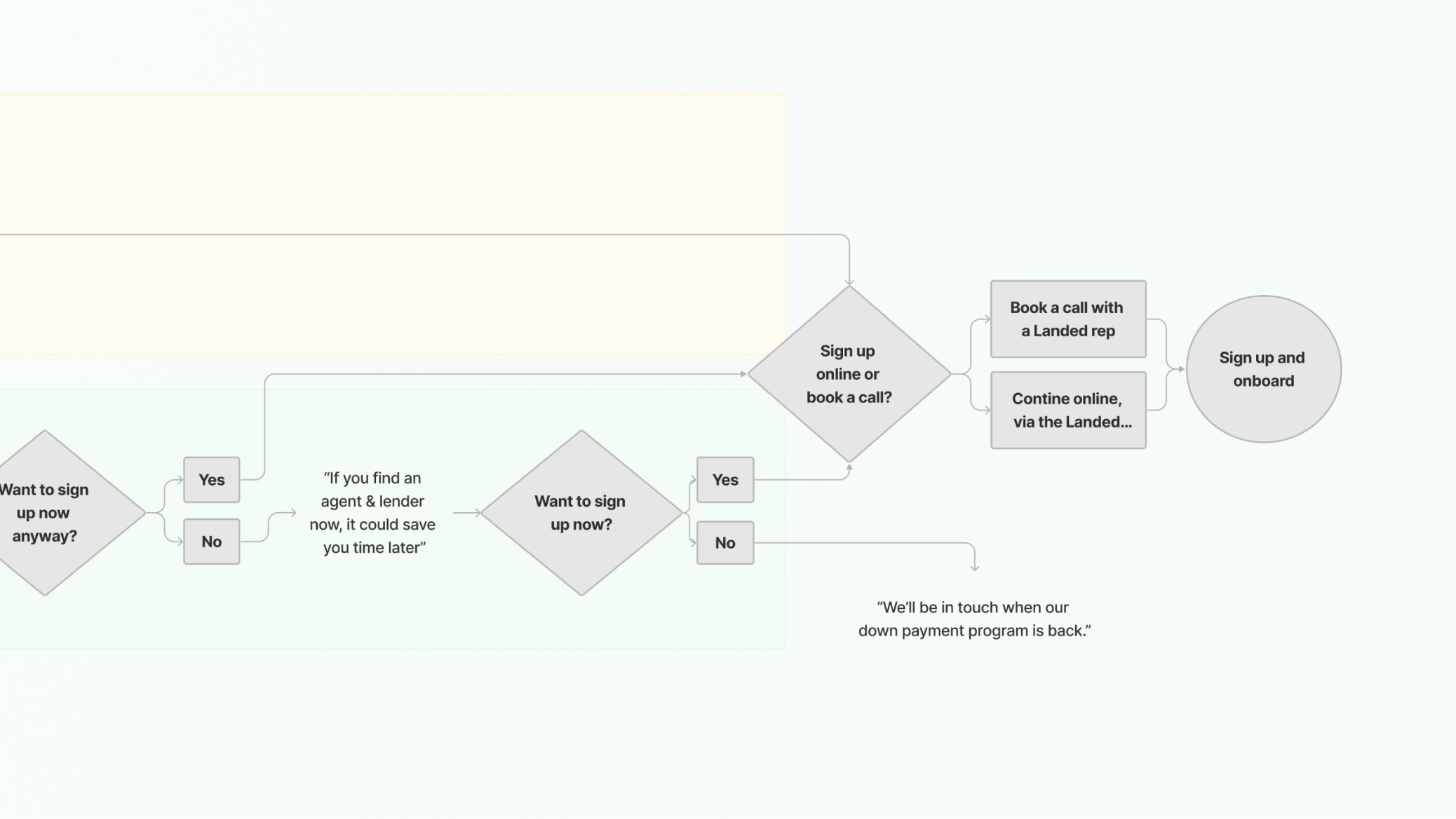
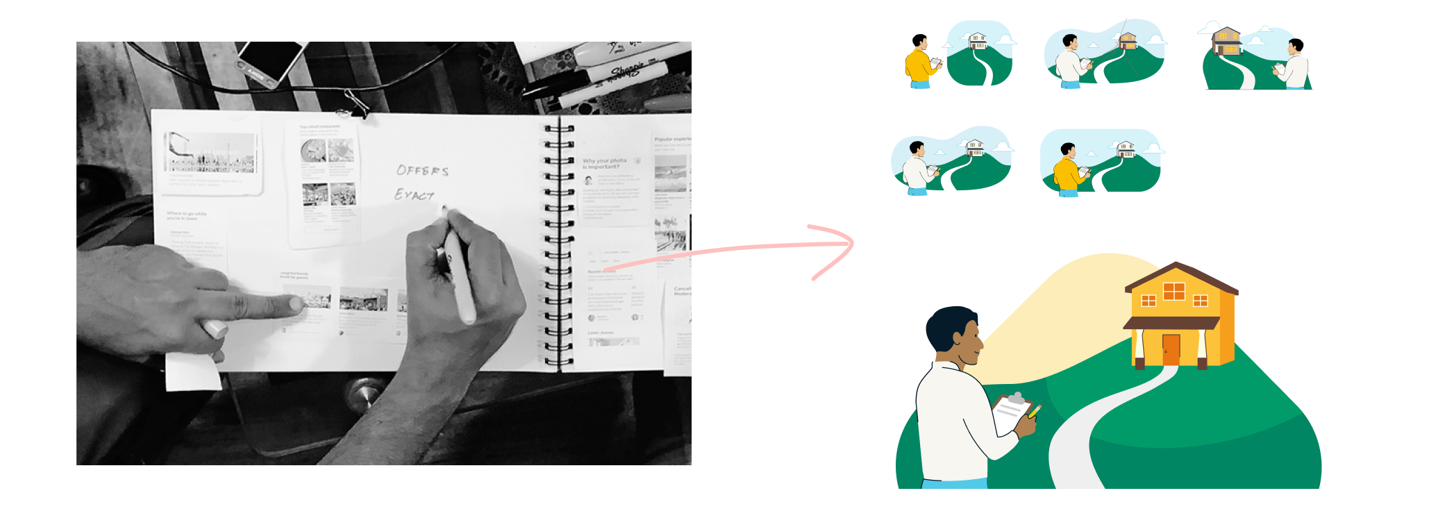
The initial ask was to retrofit our existing flow for our new service. As I sat with this design problem longer, though, I realized that the existing choicepoint page wouldn’t work in this new environment. So, I plotted out the customer journey differently, in a way that was more sensitive to their needs, and I presented this framework to our senior designer and PM:
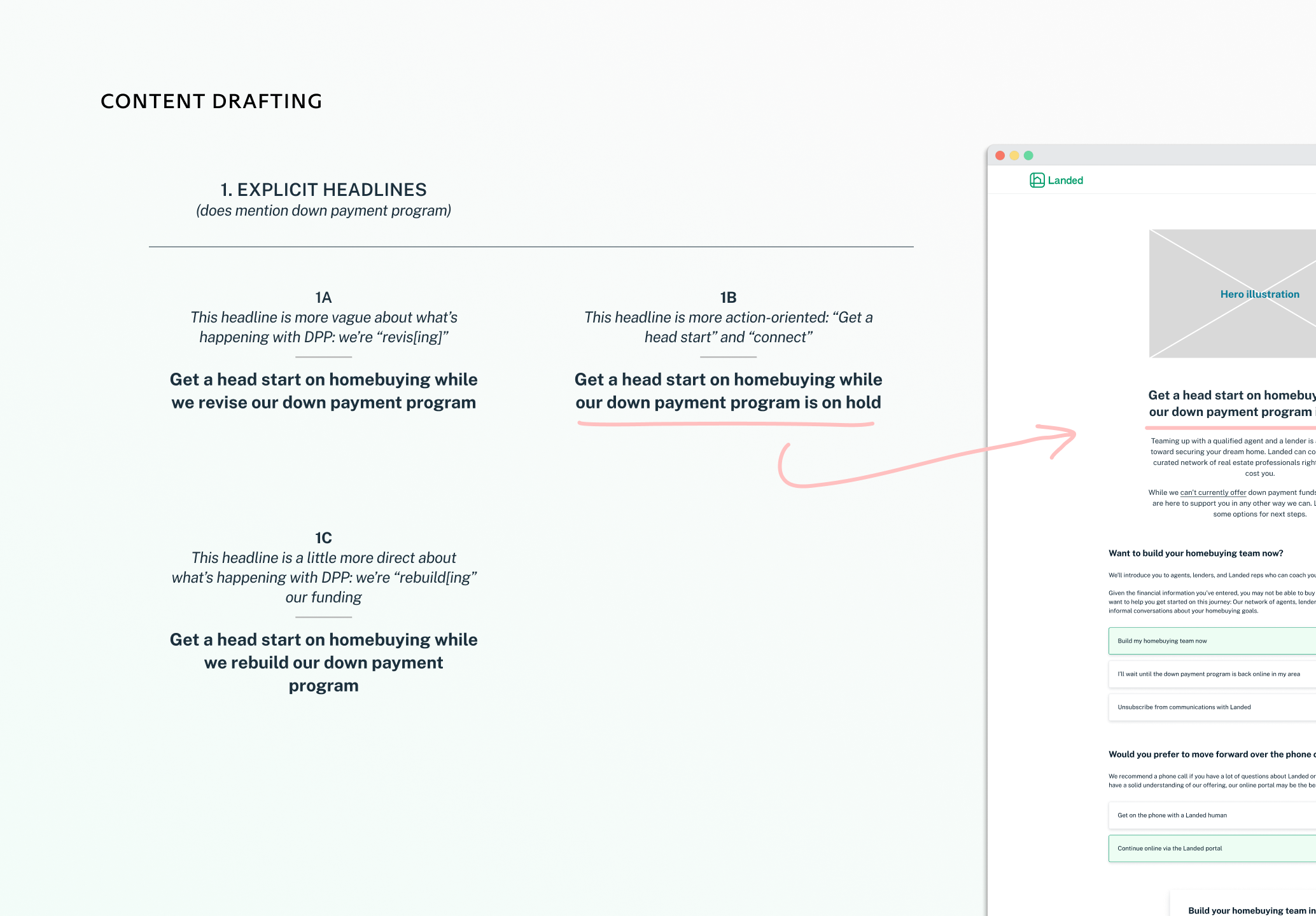
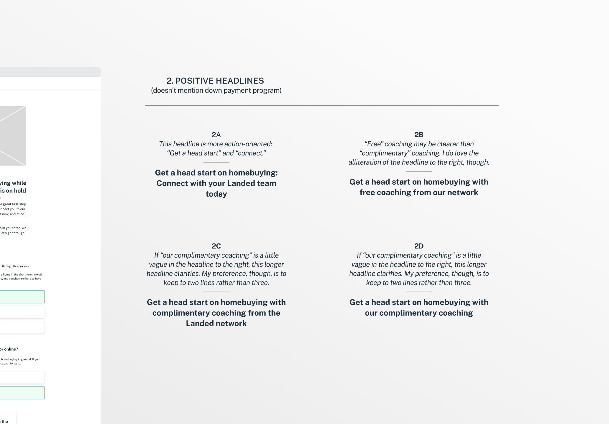
Stakeholders from different departments had conflicting opinions on the content strategy here: Do we share early that our down payment program is on hold (see explicit headlines below) or first try to sell our new services (see “positive” headlines below, in right slider image).
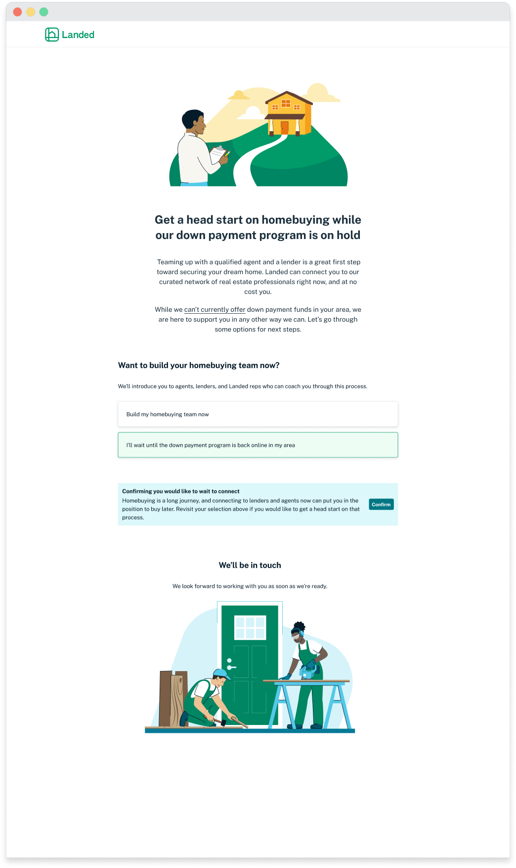
If a user chose to “opt out,” a blue flag would tell them that connecting with a real estate agent now could save them time on homebuying later. The placement of this message was a user-business compromise: While we wanted to impress this new value proposition on the user, we wanted to avoid pushiness, especially when the absence of our down payment program meant that most couldn’t afford a home at all anymore.
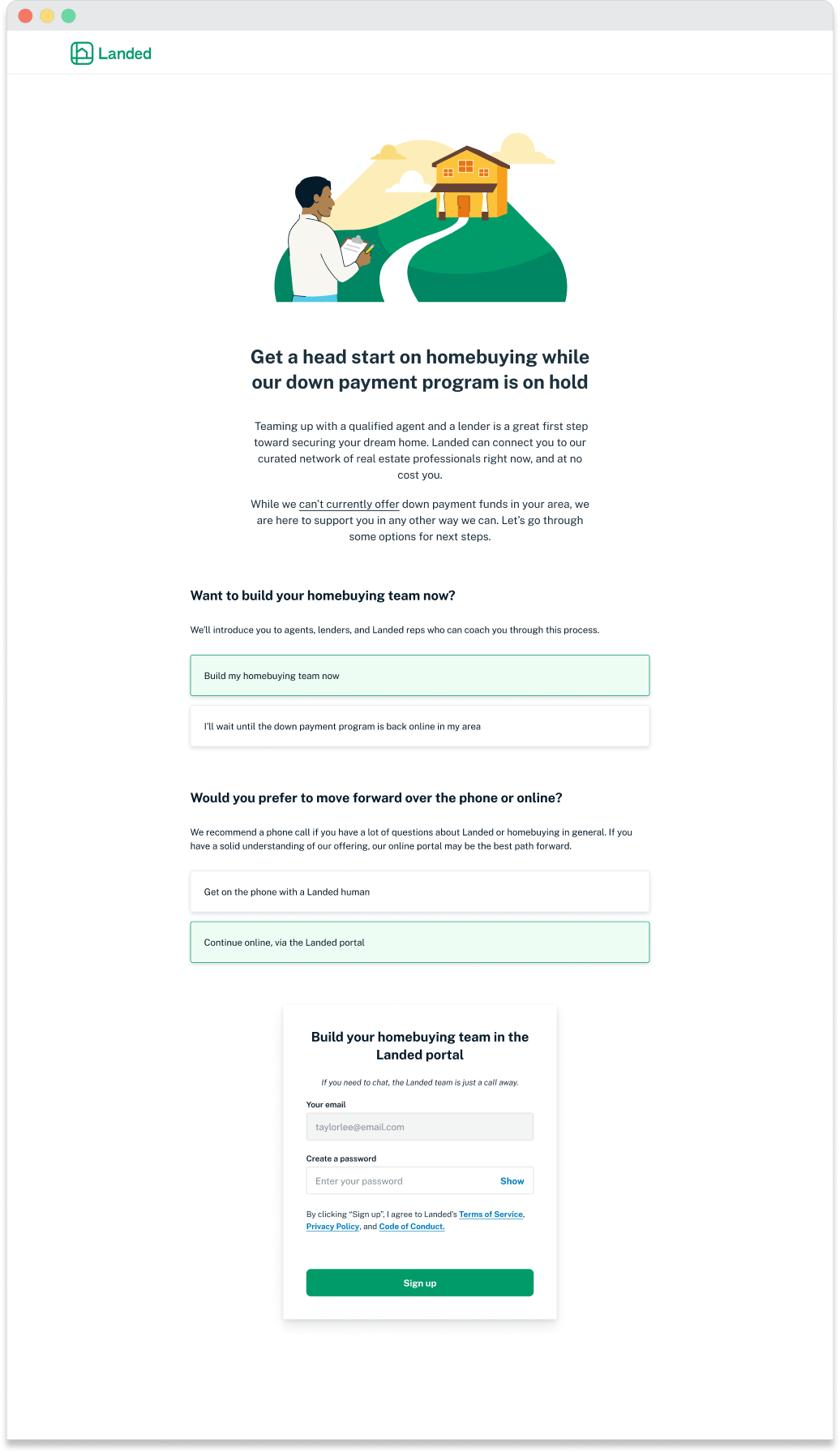
This additional layer of "opting in" to signup was more tactful than the original choicepoint: We were sensitive to users who were disappointed that they could no longer access $160,000 of down payment support.
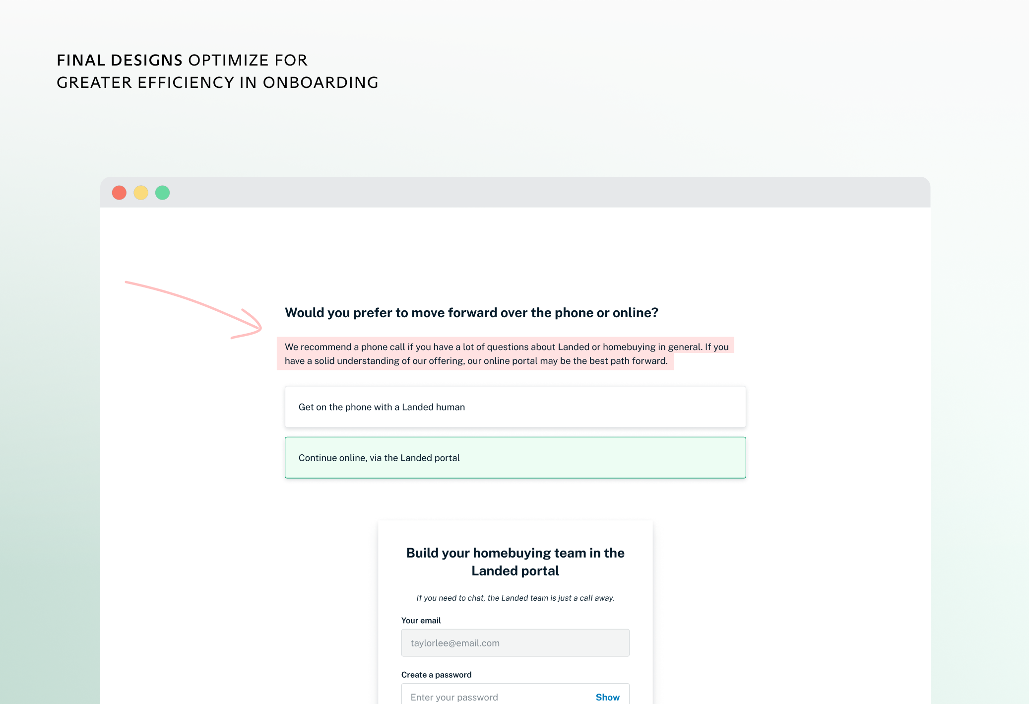
More broadly, this format also forced users to think more critically about some of their choices. For instance, one problem we had as an organization was routing users to the best onboarding method: onboarding online versus onboarding over the phone, with a Landed rep. By stripping this choicepoint screen of any visual interest, we forced users to read our guidance around what method made most sense for them.
We made plans to adapt my designs to the onboarding flow that followed these signup screens: Before we could measure the impact of this new format on conversion, however, the company had to pivot.