When I joined Landed in April 2022, our core product was down payment support: Up to $160k toward an eligible customer’s down payment. As interest rates rose this past summer, however, our investors became nervous and we could no longer support that down payment support program—we had to pivot.
Landed became the Homebuying Navigator for essential professionals: we would connect teachers, nurses, and other eligible customers to the resources they needed to buy a home, including other, still-running down payment support programs.
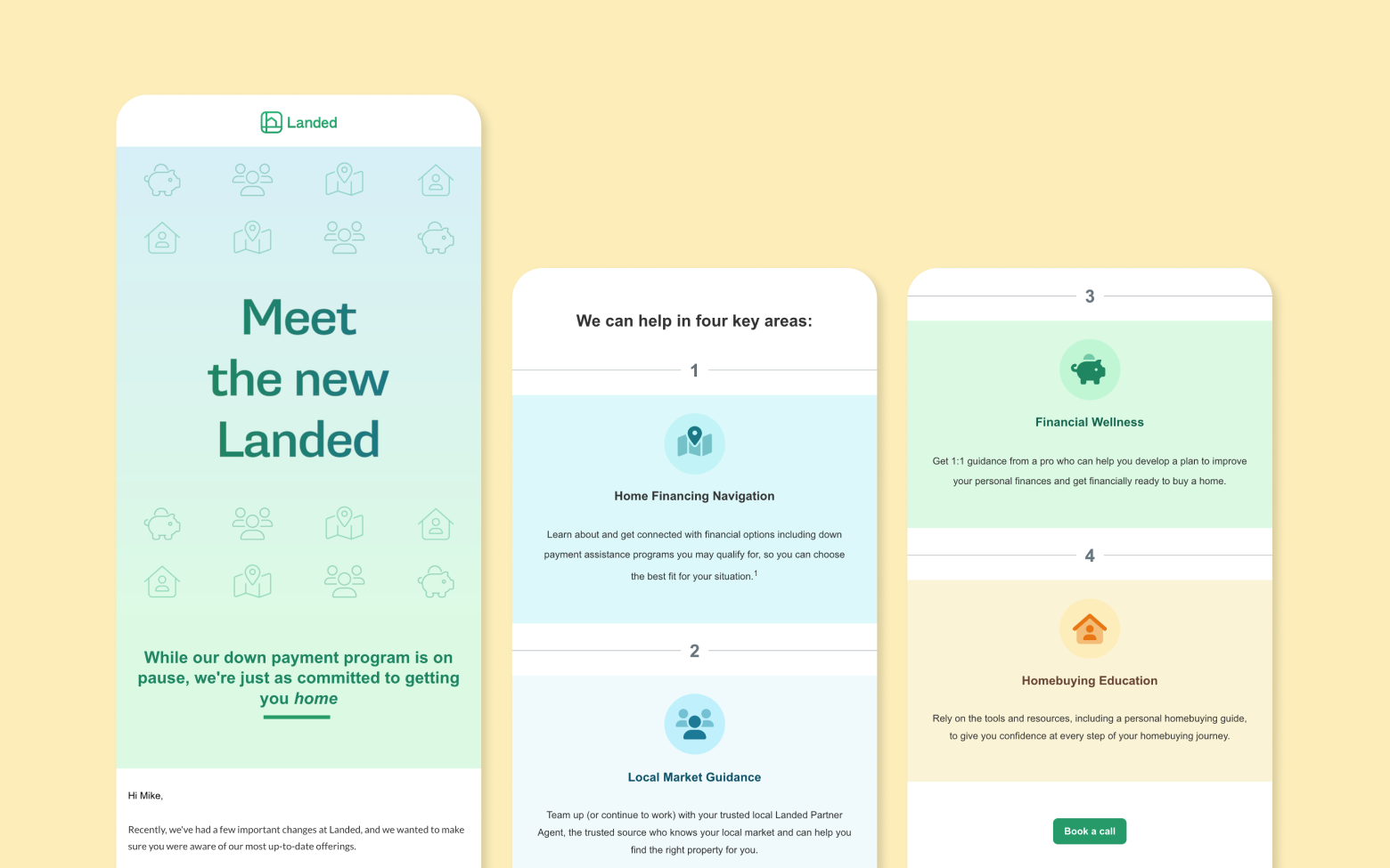
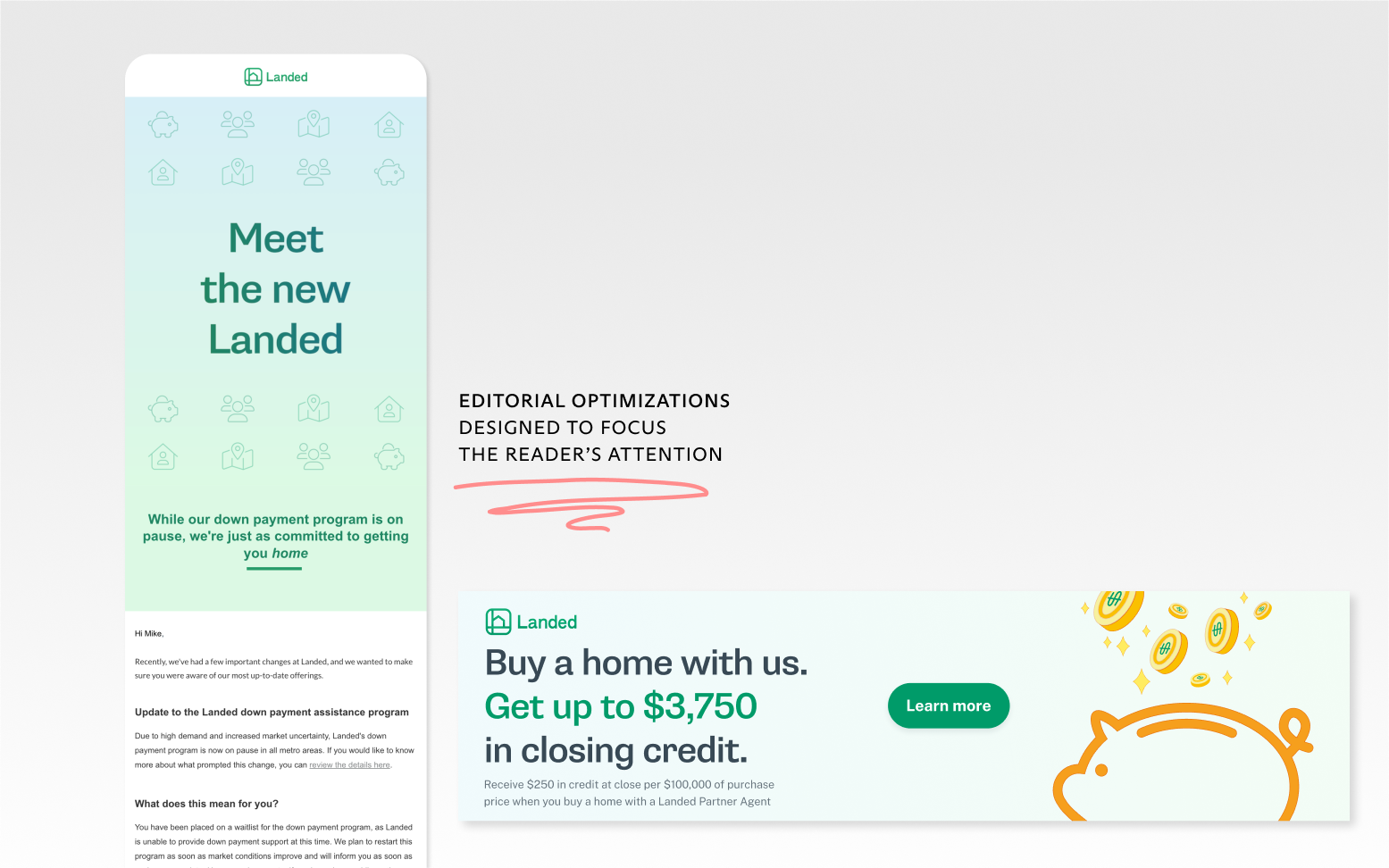
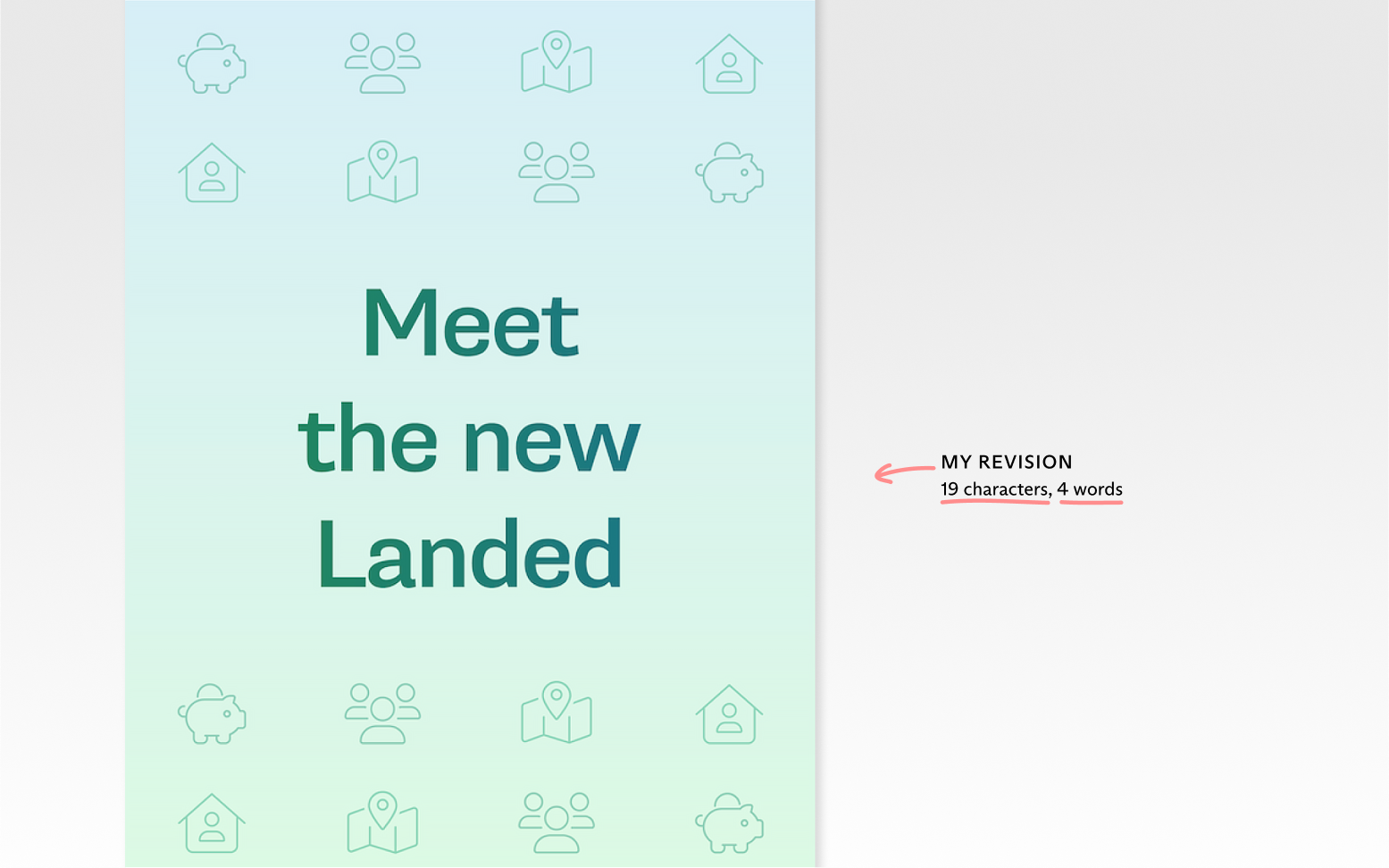
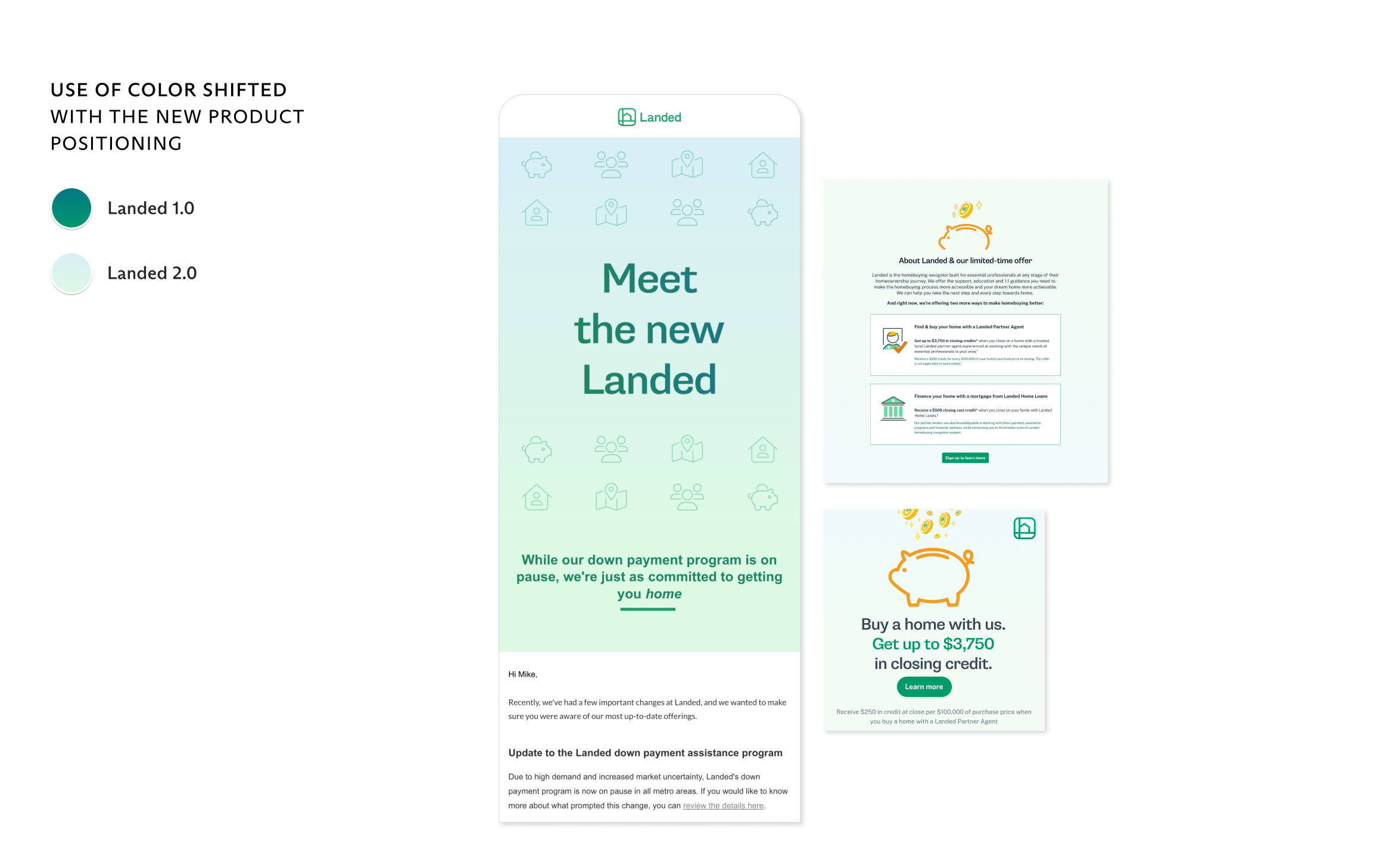
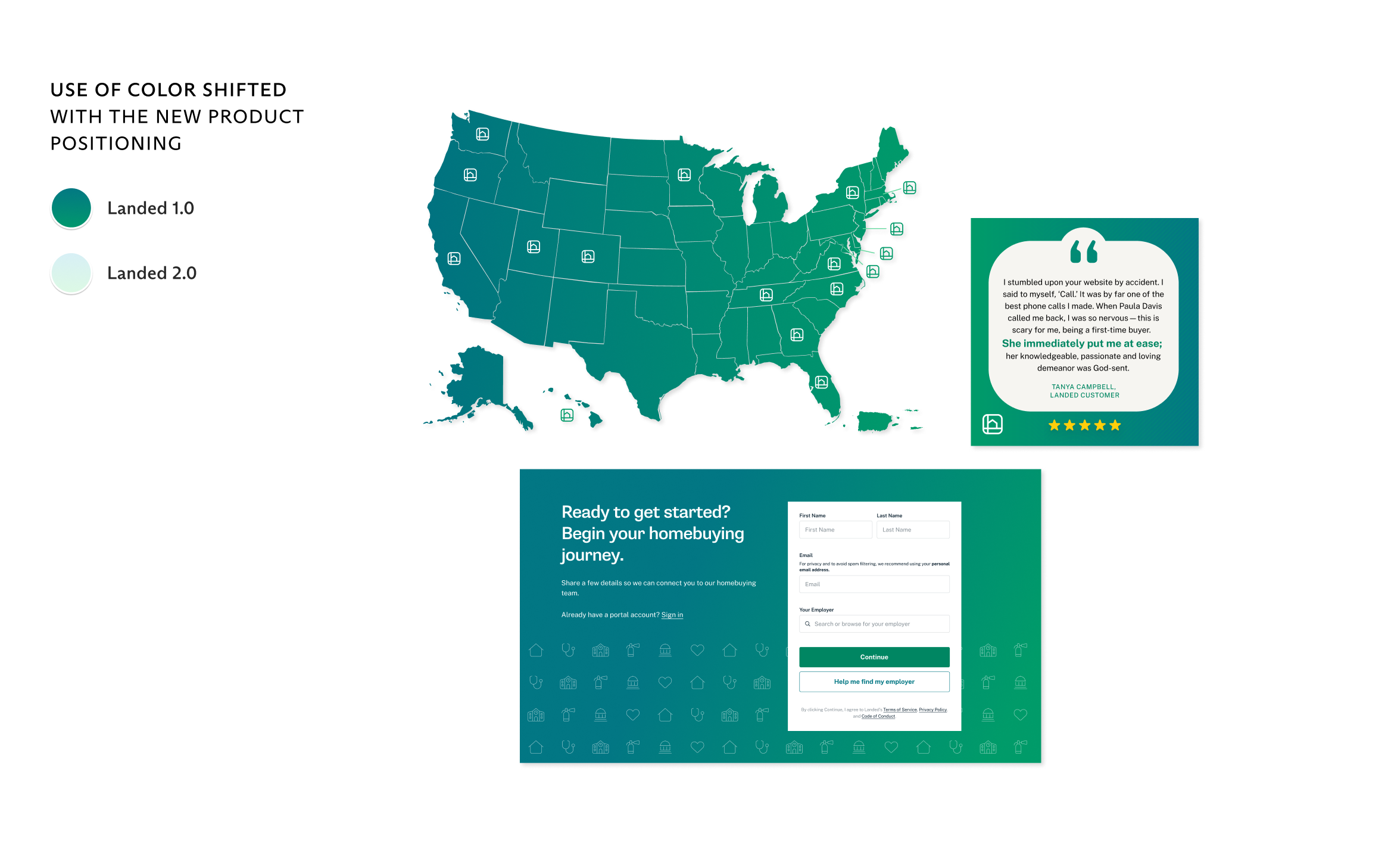
I shifted the brand away from some of our more recent visual directions toward something still familiar but fresher—in effect, to signal to potential customers that this was a new Landed. One key feature of this tactic: I moved away from our oft-used dark gradient toward a light-blue and light-green gradient. The change was still within existing brand standards but suggested a freshness to our new pitch and product.
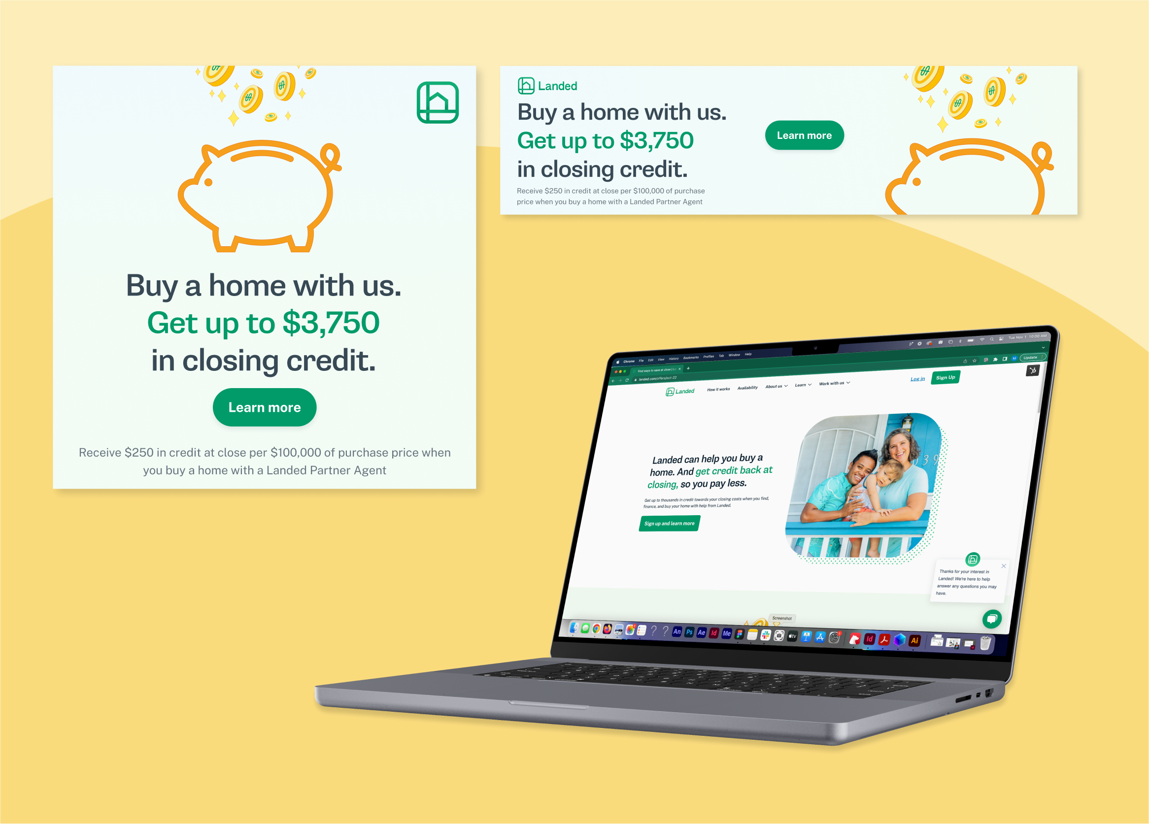
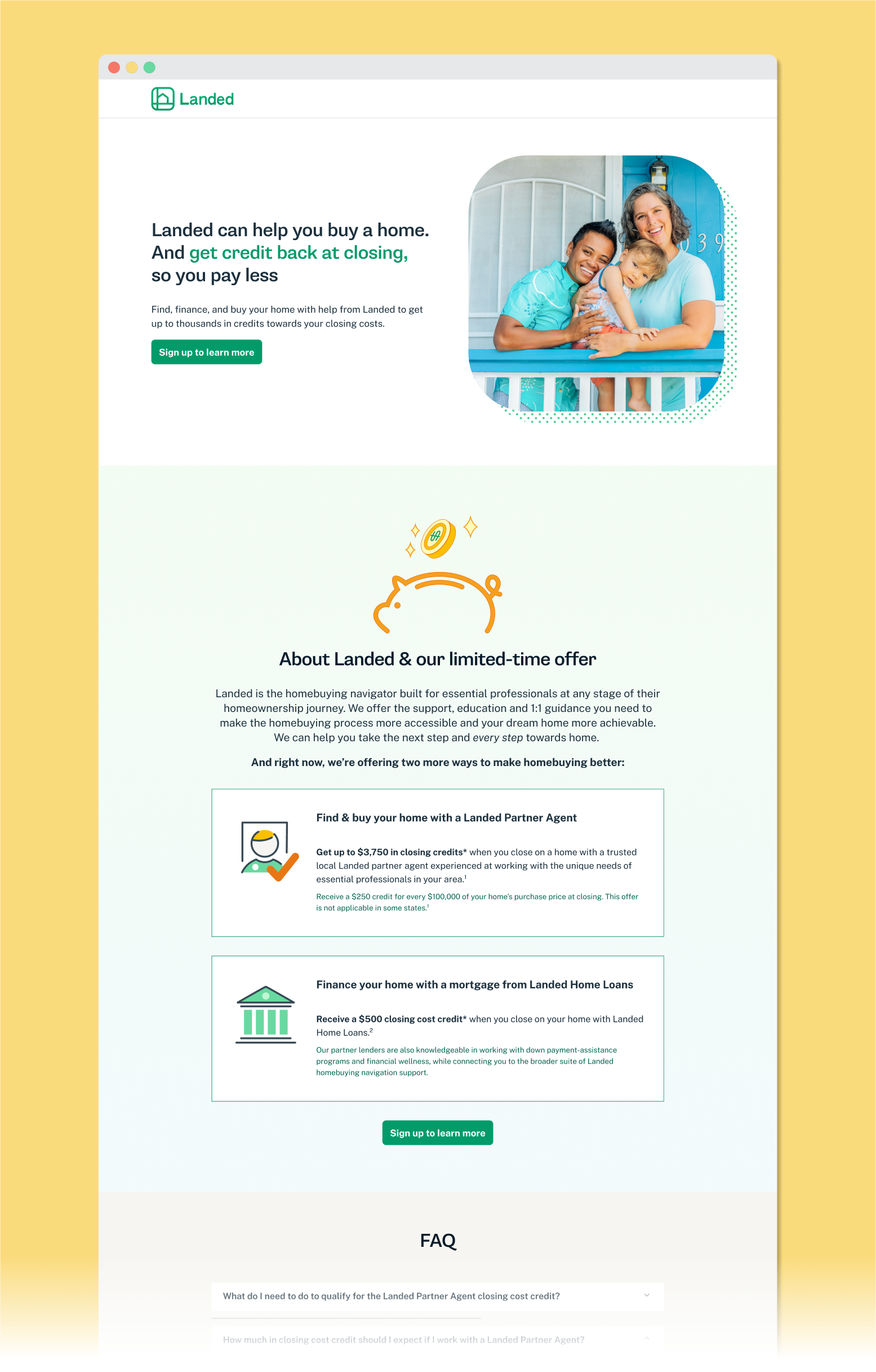
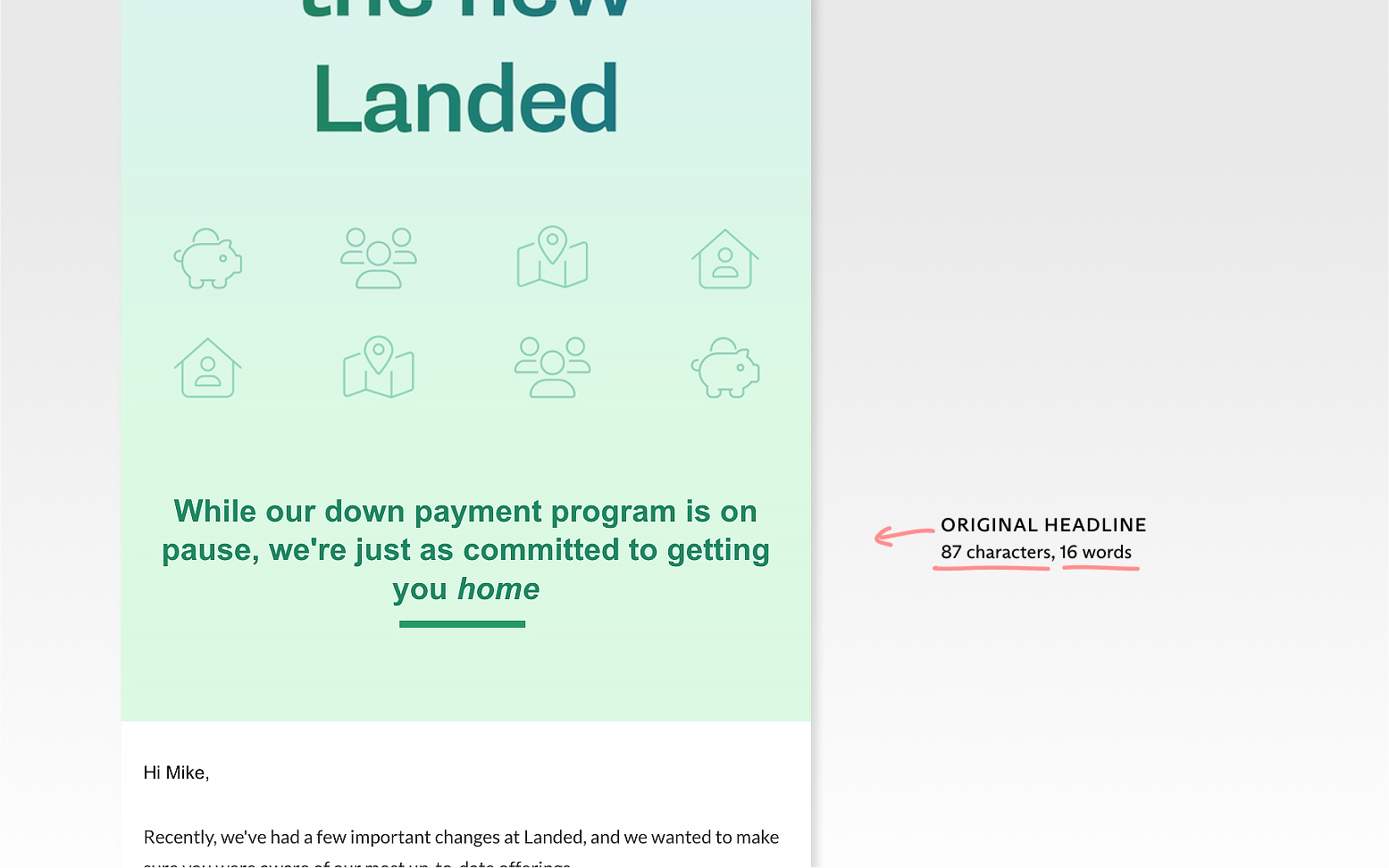
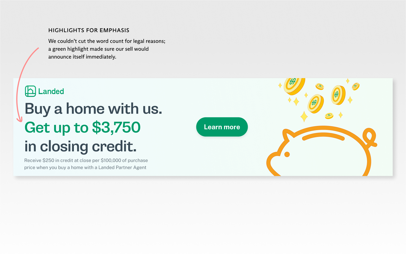
Many of the initial drafts I received from our freelancers suffered from a high word count (hard to avoid when you’re talking about a complicated product like shared appreciation homebuying). My edits helped focus the eye on the hook and key messaging.